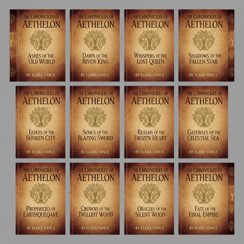
Bold black logotype carved with surgical precision on cream paper

Logotype — Meridian Press
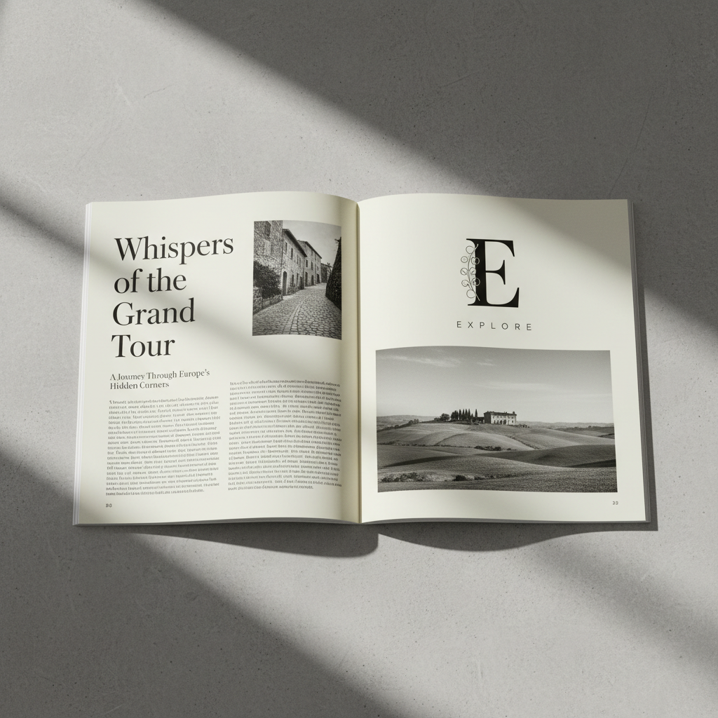
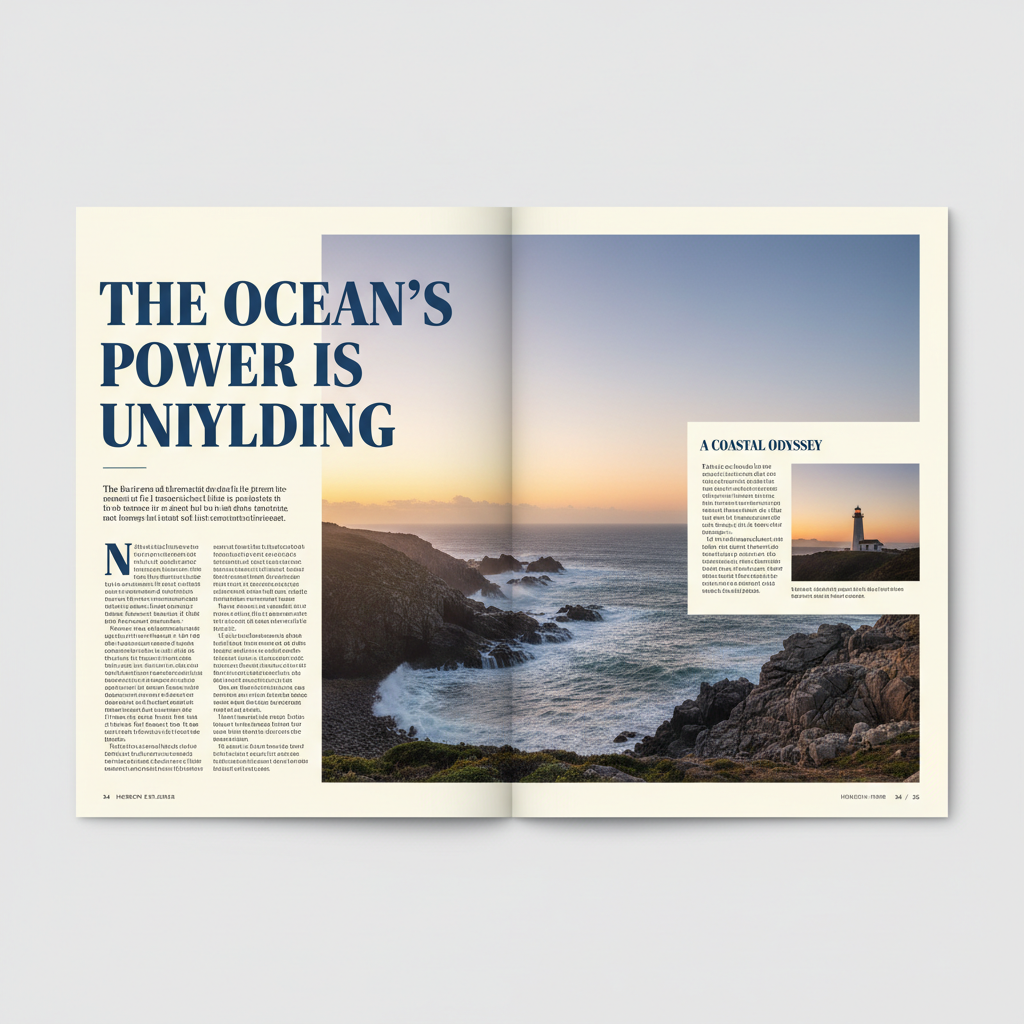
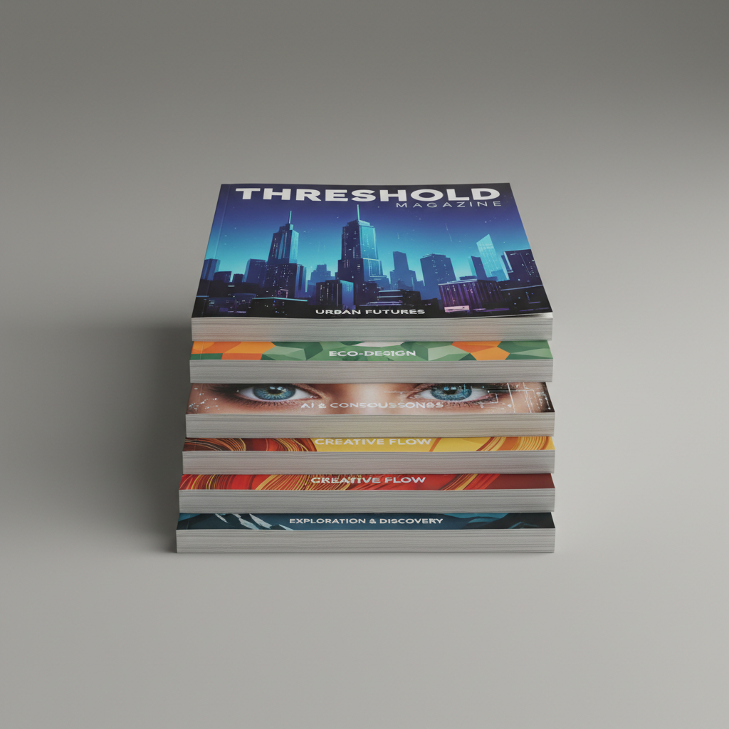
Editorial magazine spread with open white space and refined typography

Editorial — Threshold Magazine

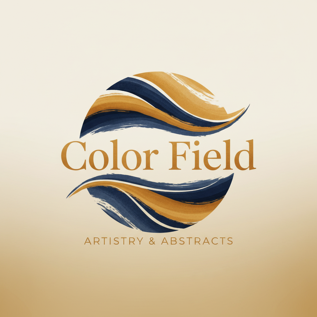
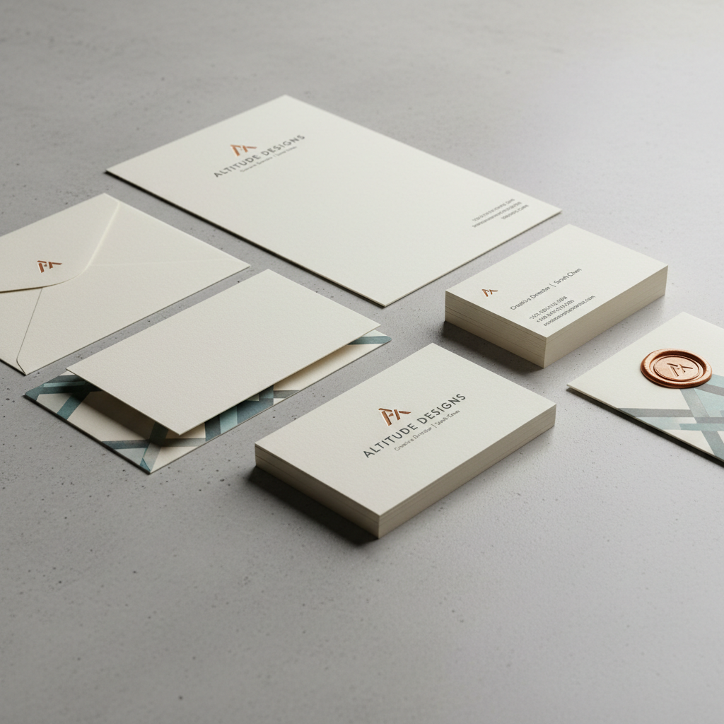
Color field brand identity with warm ochre and deep navy palette

Brand Identity — Aura Collective

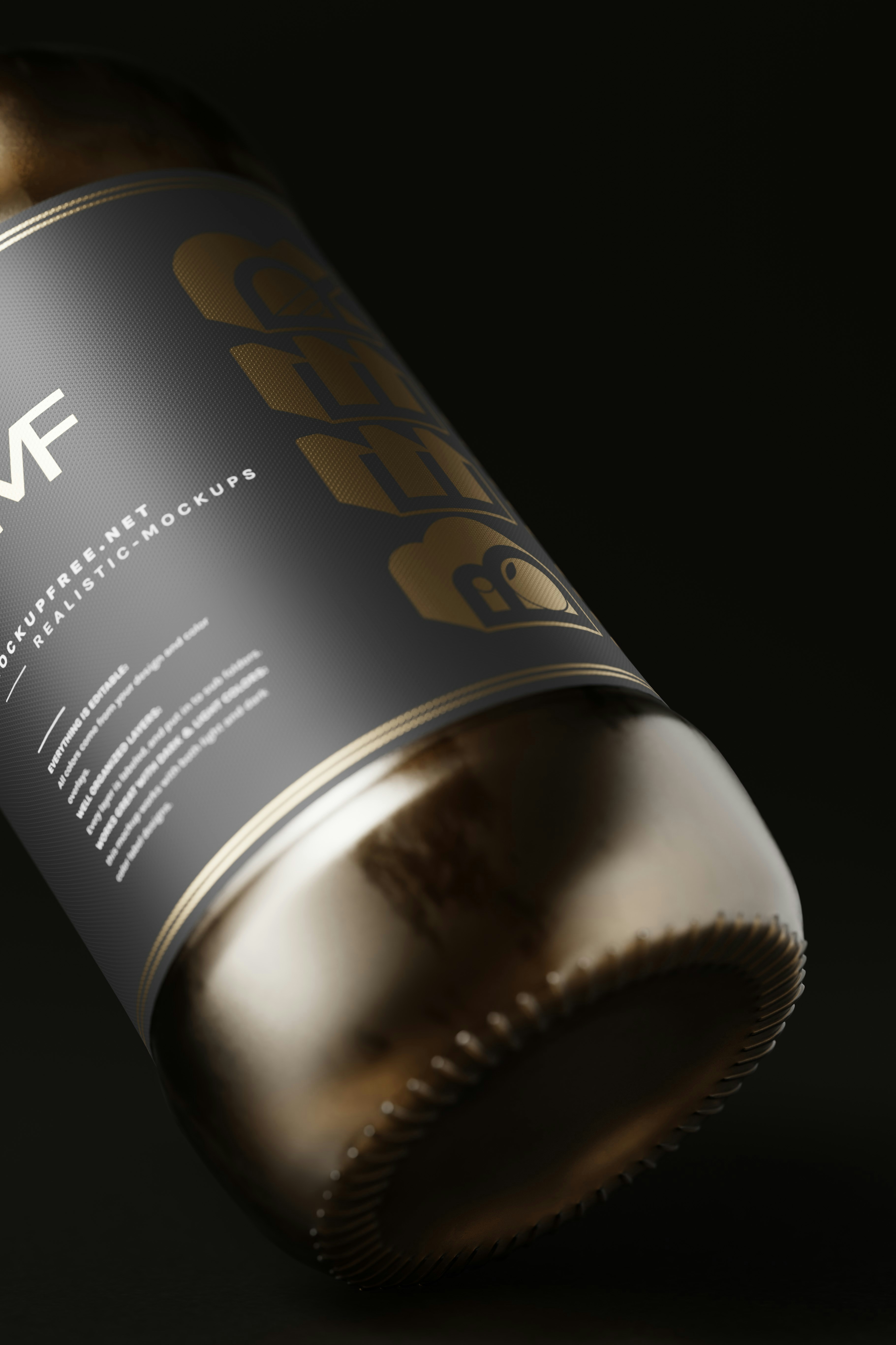
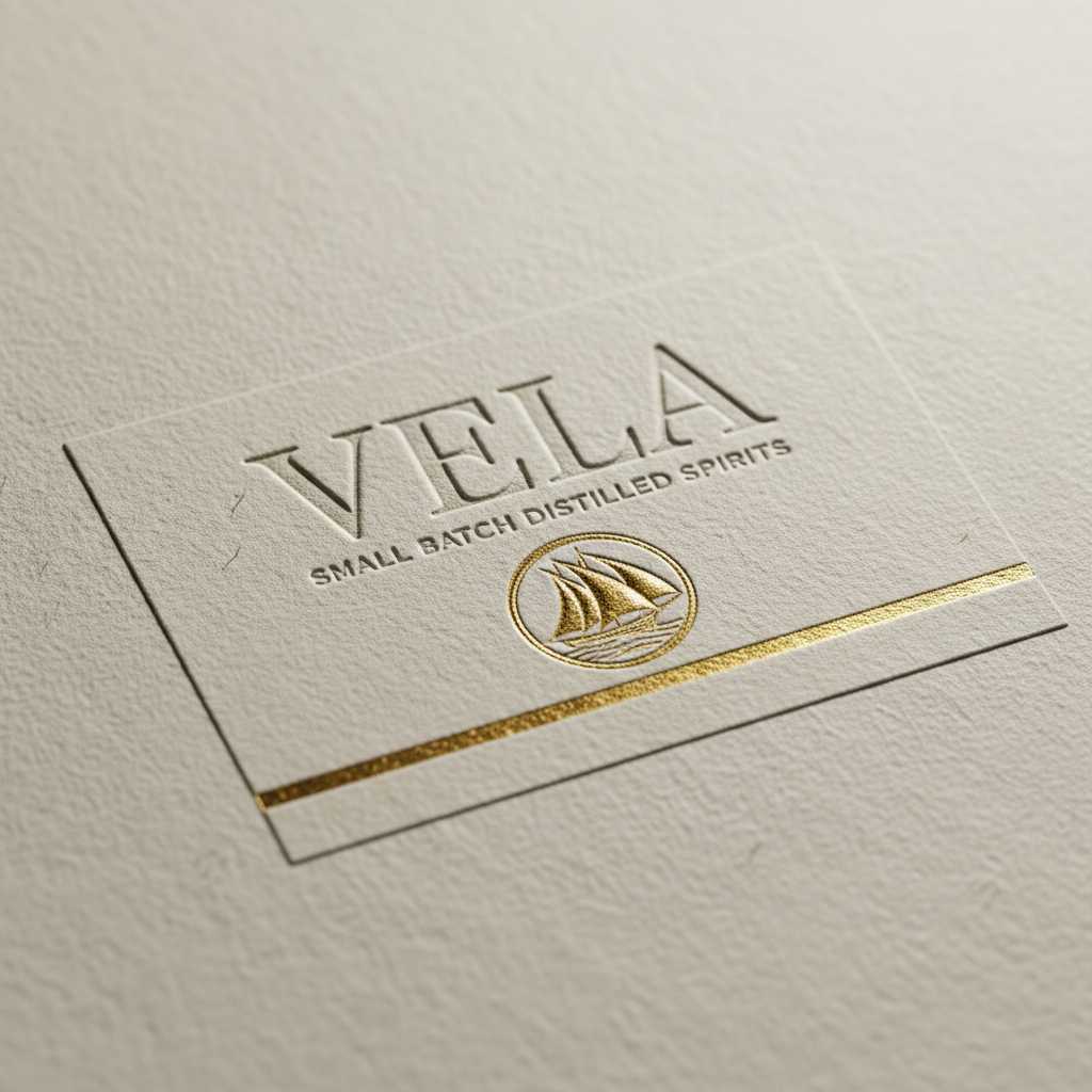
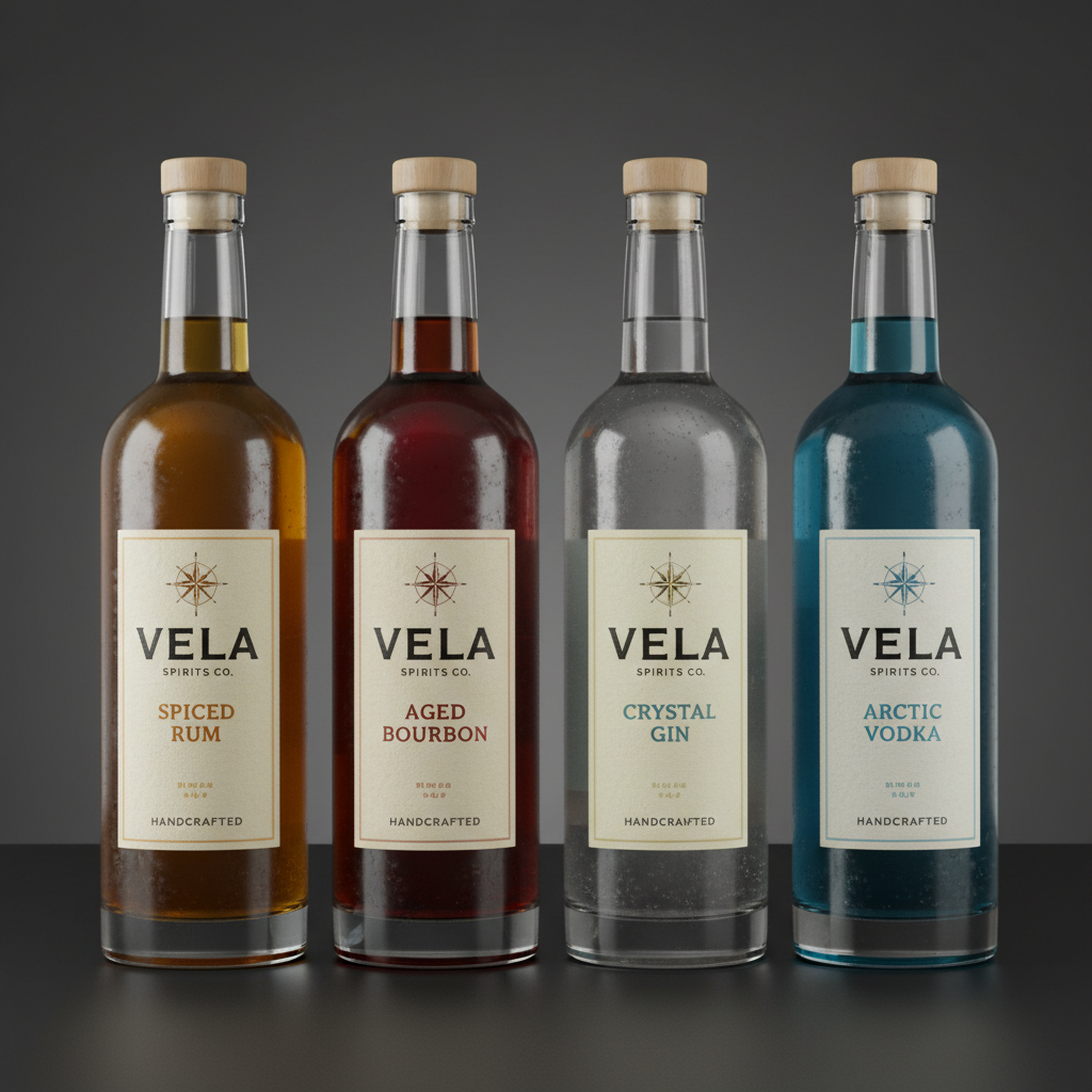
Packaging design with foil-stamped label on dark glass bottle

Packaging — Vela Spirits

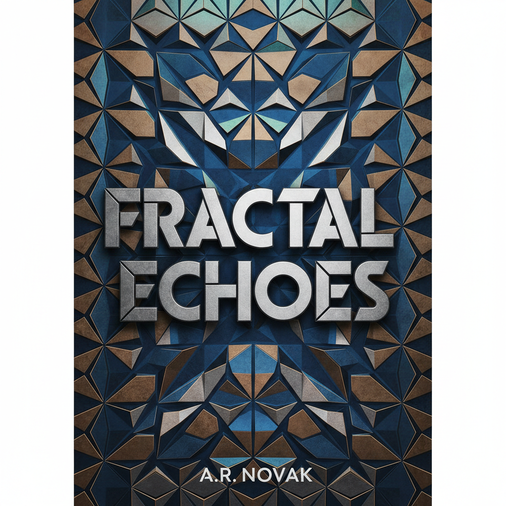
Book cover design with embossed texture and geometric letterform

Cover Design — Farrow & Sons

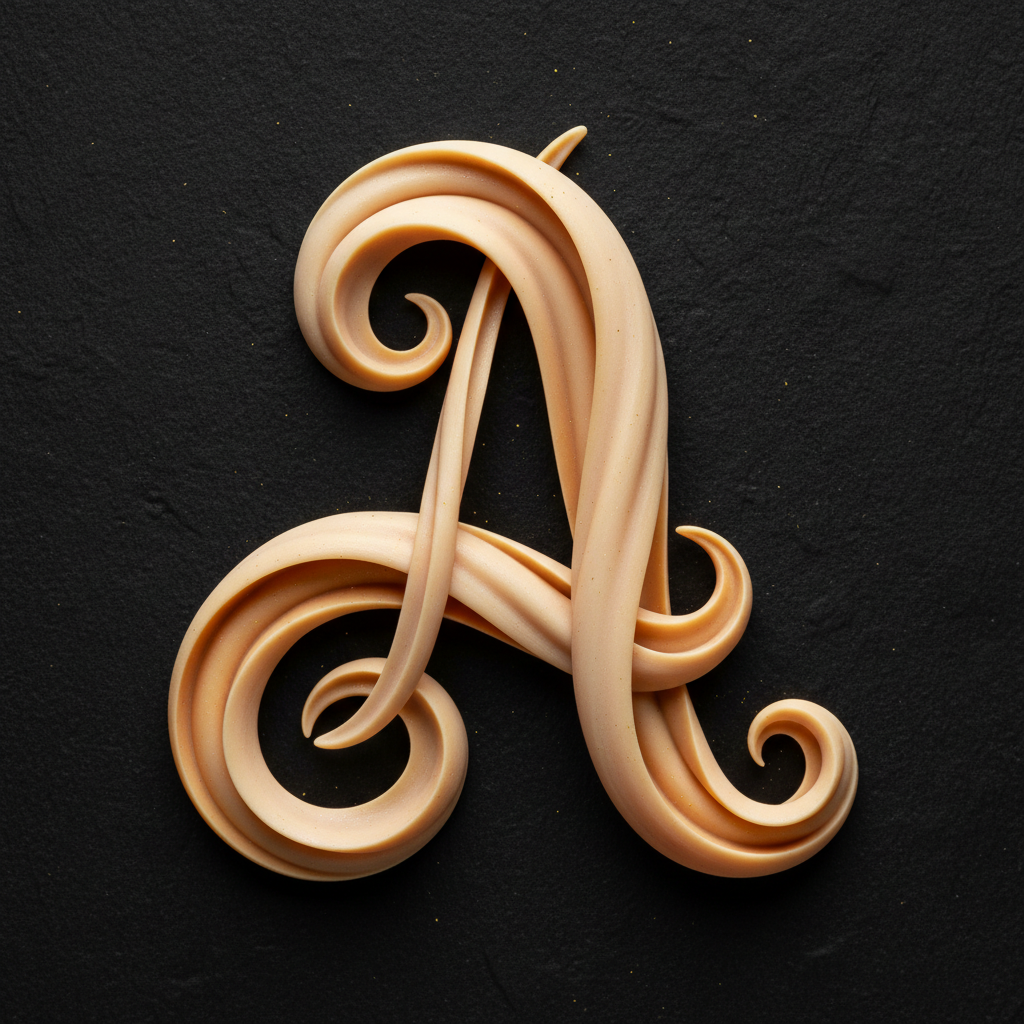
Custom display typeface letterform detail in warm cream on black

Type Design — Caslon Display

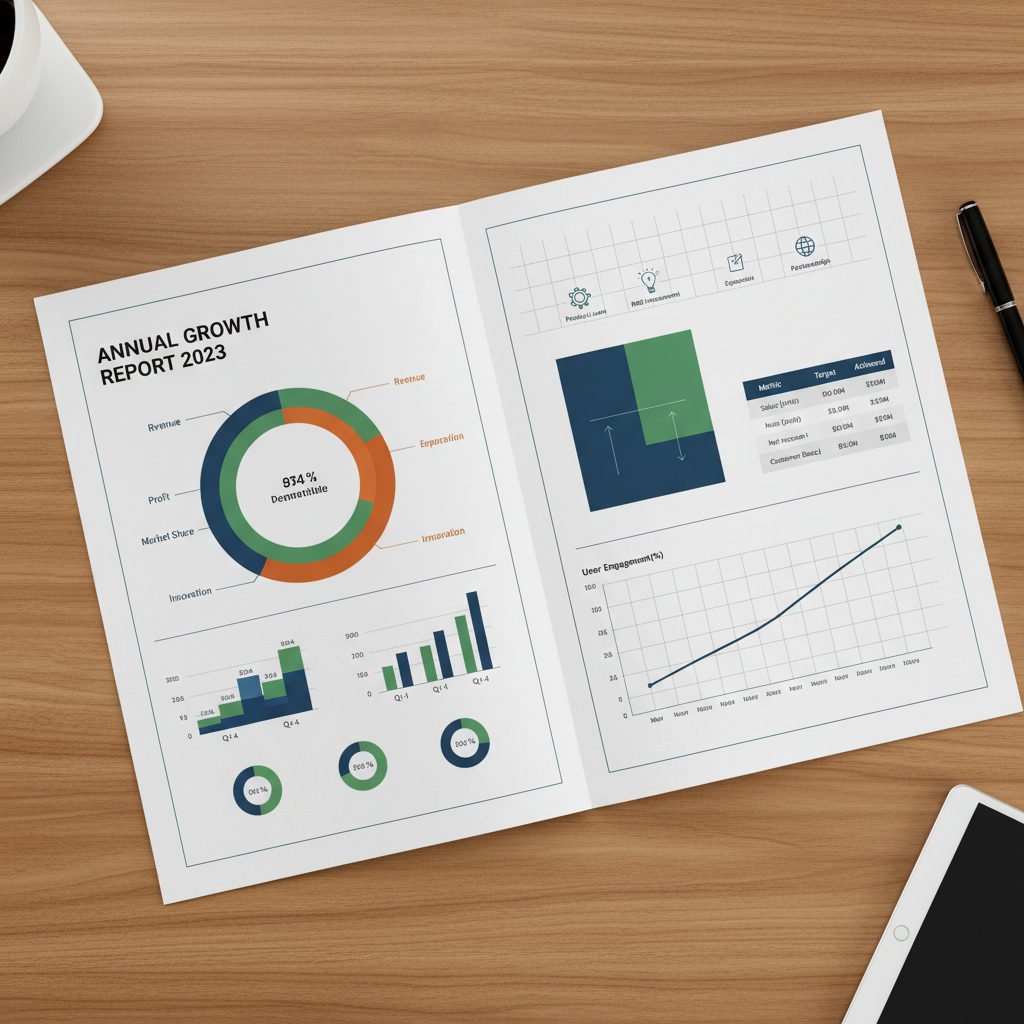
Annual report spread with precise grid system and data visualization

Annual Report — Tidal Capital

Work selected 2019–2025.

Scroll to enter

Folio

Graphic Design Studio

Brand IdentityEditorial DesignPackagingBook Cover SeriesLogotypeType SystemsPrint ProductionGrid SystemsFoil StampingLetterpress

Selected Works

Five years of deliberate craft.

Client

Meridian Publishing House, New York

Brief

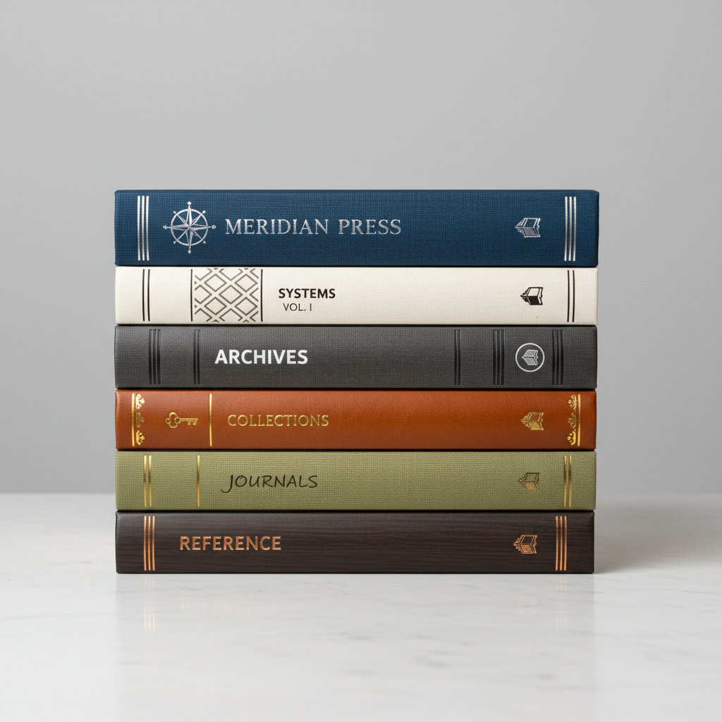
A complete identity system for an independent publishing house — wordmark, colophon, spine treatment, and endpaper patterns. The mark draws from 19th-century letterpress anatomy, redrawn at 0.5pt increments until the serifs held at 6pt.

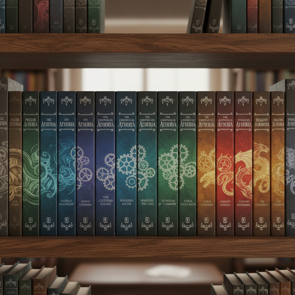
Meridian Press brand system book stack with spine treatments

Spine system — 12 titles, 3 series

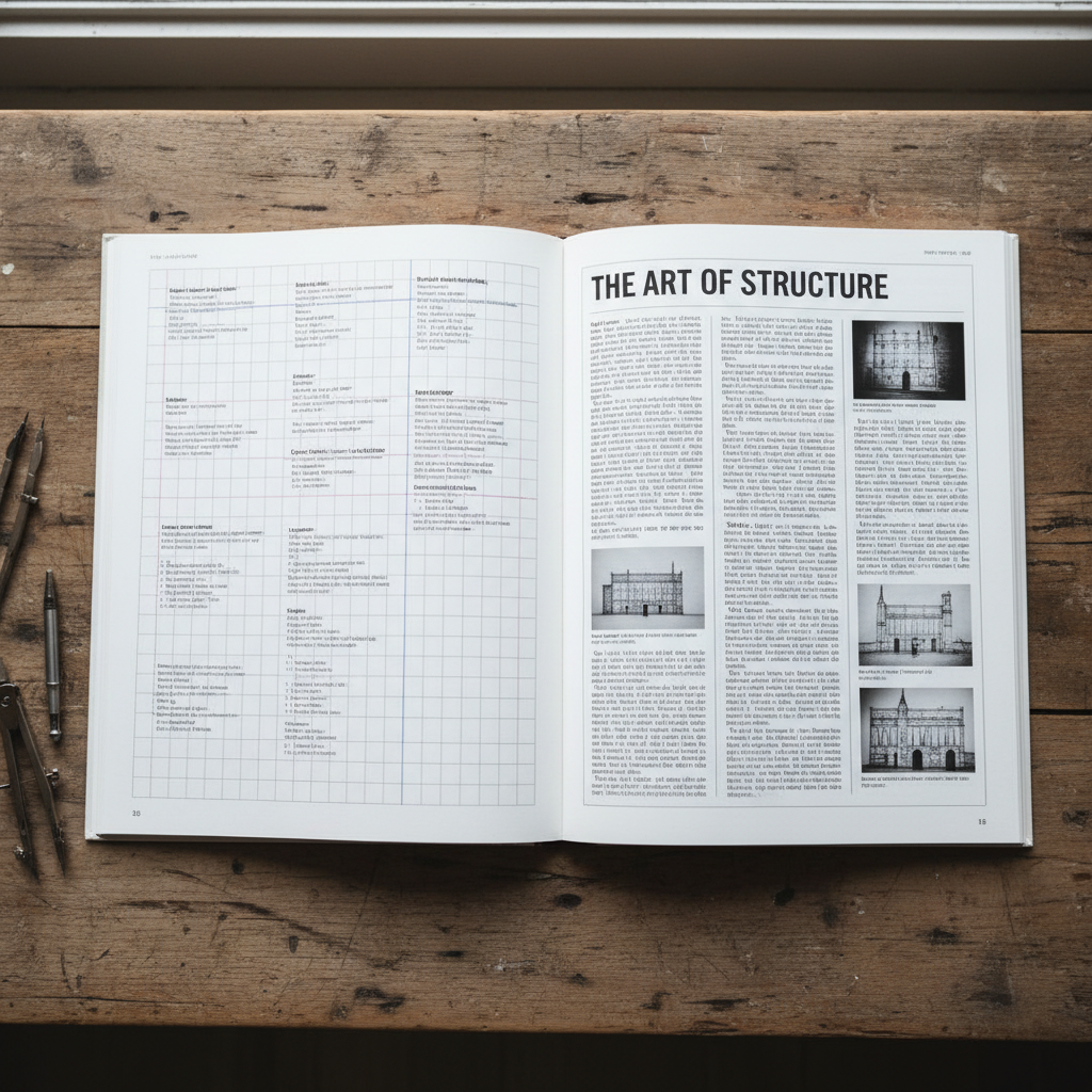
Open book spread showing interior typography and grid system

Interior grid — 9-column, 2pt baseline

Client

Threshold Media, Los Angeles

Brief

Six-issue annual design for a quarterly arts magazine. Each issue remakes the grid — the only constant is a 14pt leading and a single typeface family. The covers are printed on 350gsm uncoated stock with a single Pantone hit.

Magazine spread with full-bleed photography and minimal caption typography

Issue 04 — The Silence Between

Stack of Threshold Magazine issues showing cover progression

Cover series — Pantone 872C gold hit

Client

Vela Distillery, Portland, OR

Brief

Label system for a craft spirits range — four expressions, one visual language. Each label is letterpress-printed on 120gsm cotton stock with a foil-stamped navigational element. The typographic hierarchy maps directly to proof and provenance.

Vela Spirits label detail showing letterpress texture and foil stamp

Label detail — Letterpress + foil

Vela Spirits four bottle range in row on dark surface

Full range — 4 expressions

Client

Aura Creative Collective, Brooklyn, NY

Brief

A living identity for a multi-disciplinary creative studio — flexible enough to stretch across motion, print, and digital without losing gravity. The mark is a geometric reduction of the letter A, constructed on a 12-unit grid.

Brand identity collateral spread with business cards and stationery

Identity system — 24 touchpoints

Digital application of Aura brand on screen and in motion

Motion identity — 3s loop

Client

Farrow & Sons Publishers, Chicago

Brief

Cover series for a literary fiction imprint — twelve titles, one consistent spine width, zero stock photography. Every cover is built from typographic material: letterforms scaled past recognition, set on a single axis, printed in two colors on uncoated.

Book cover series showing typographic treatment across twelve titles

Series — 12 titles, 2 colors each

Book spines arranged on shelf showing cohesive series design

Shelf presence — 22mm spine system

The Process

From sketch
to press proof.

Every project follows the same four-phase rhythm — not because it is efficient, but because it produces work that holds up when the invoice is long forgotten.
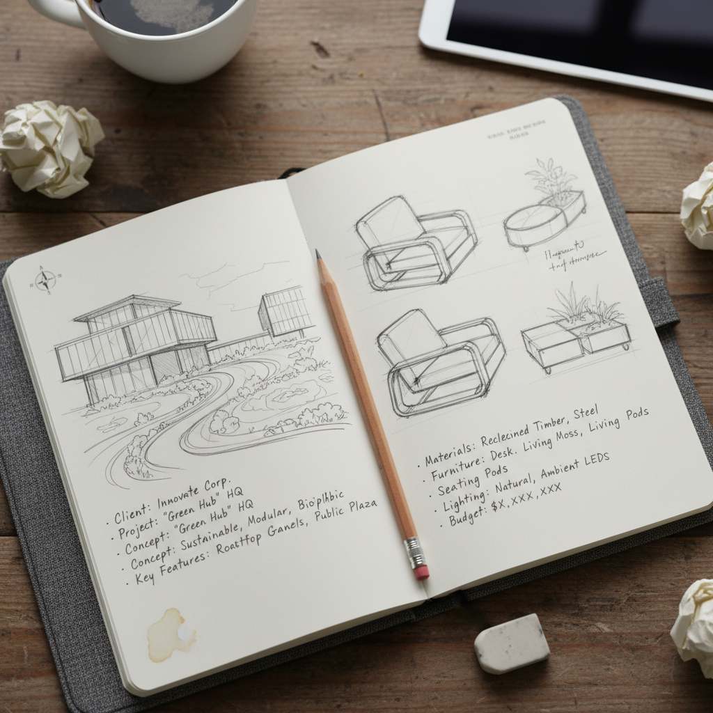
Designer notebook with pencil sketches and written brief notes on cream paper

Brief session — pencil on Moleskine

—01

Brief & Archaeology

Before a single mark, there is listening. Every project begins with a conversation about what already exists — the company's history, its competitors, the materials it touches, the people it serves. The brief is never the brief.
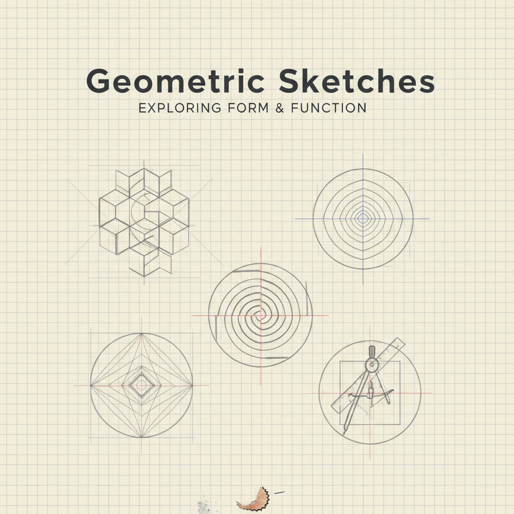
Grid paper with geometric logo sketches and construction lines in pencil

Sketch phase — 100 variations, 3 survive

—02

Sketch & Grid

Marks are drawn by hand first — always. Not because digital is wrong, but because the hand knows when something is off before the eye does. The sketch phase produces 60–100 variations. Three make it to screen.
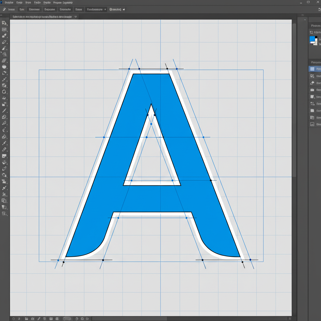
Illustrator artboard showing vector letterform with bezier handles and construction grid

Vector refinement — optical not mathematical

—03

Vector & Proof

Digital refinement is surgical. Bezier handles are placed at optical centers, not mathematical ones. Every curve is tested at 6pt on uncoated stock before a client sees it. What looks right on screen must also hold in ink.
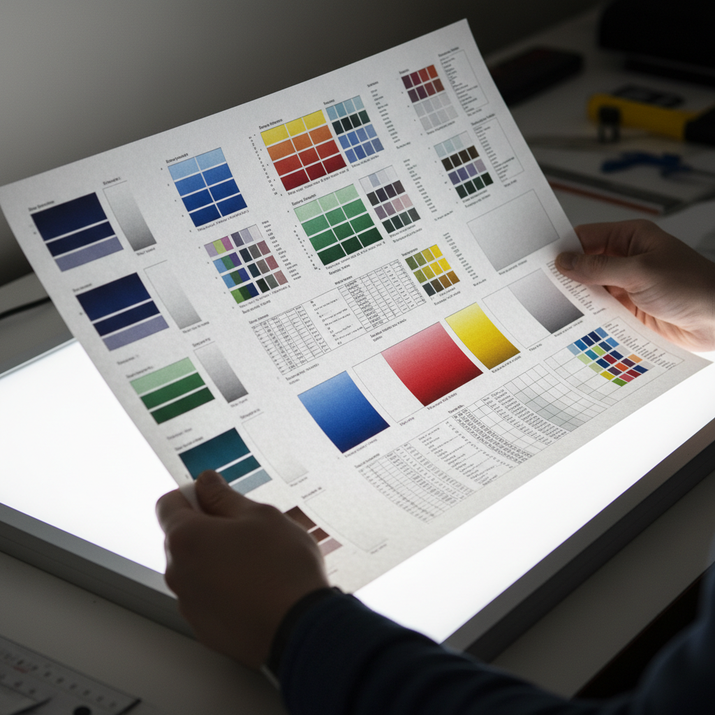
Printed proof sheet being held over lightbox showing color and typography accuracy

Press proof — 350gsm uncoated, Pantone matched

—04

Print & Deliver

The final deliverable is tested in the medium it will live in. For print: press proofs on the specified stock. For screen: device previews at actual size. Nothing ships until it has been held, read, or loaded at 3G.

Client Voices

What the work opened.

"We briefed three studios. The other two sent mood boards. She sent a question list that made us rethink our positioning before a mark had been drawn. The resulting identity is the first thing clients mention when they walk in."

Rachel Okonkwo, Creative Director at Aperture Campaigns, smiling in office

Rachel Okonkwo

Creative Director

Aperture Campaigns, NYC

Brand Identity — 6-week turnaround

"We had a Canva logo and a dream. After working with Folio, we had a brand system that could sit next to our Series A investors' portfolio companies without flinching. The wordmark alone has been commented on in four pitch meetings."

James Whitfield, CEO of Strata Labs, professional headshot

James Whitfield

Co-Founder & CEO

Strata Labs, San Francisco

Startup Brand Identity — Pre-Series A

"The cover series for our autumn fiction list sold out at Frankfurt. Three rights buyers mentioned the design before the manuscripts. We've since commissioned two more series. The spine width problem — something no other designer had even asked about — was solved in the first call."

Margaret Hollis, Publisher at Farrow and Sons, in library setting

Margaret Hollis

Publisher

Farrow & Sons, Chicago

Cover Series — 12 titles, sold out Frankfurt

47

Projects completed

19

Brand identities

12

Publishing clients

6

Years in practice

Start a Project

Tell me what
you're making.

Currently accepting brand identity and editorial projects for Q3 2026. Packaging and cover series have a 6-week lead time. Everything begins with a single conversation.

Available for new projects

Download Case Study PDF

$10k
$3k$100k+
Start a Project